How Website Design Directly Impacts Conversion Rates
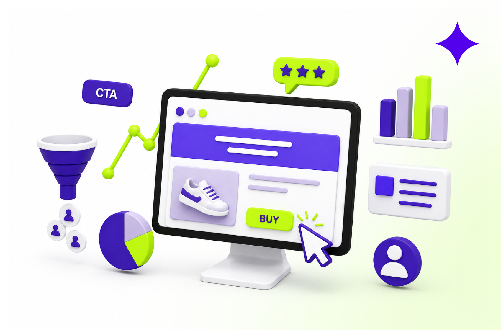
Getting people to visit your website is only half the job.
You can invest in SEO, paid advertising, social media, email marketing, and content campaigns to generate traffic. But once a visitor lands on your website, the experience they see determines what happens next.
Do they explore your services?
Do they trust your business?
Do they click the call-to-action?
Or do they leave?
This is where the relationship between website design and conversion rate becomes impossible to ignore.
A website is not simply a digital brochure. It is part of your sales process. Every headline, button, image, content section, and navigation choice can either move a visitor closer to conversion or create another reason to leave.
For growing businesses, understanding how website design impacts conversions is essential. Better design is not about making a website look more expensive. It is about creating an experience that helps people understand, trust, and act.
What Is a Website Conversion?
A website conversion happens when a visitor completes an action that supports a business goal.
That action could be booking a consultation, requesting a quote, purchasing a product, starting a free trial, creating an account, subscribing to a newsletter, or downloading a resource.
The specific conversion depends on your business model.
However, the principle remains the same: a visitor arrives with a question, need, or intention, and your website must make the next step clear.
This is why conversion-focused website design starts with user behaviour rather than decoration.
A beautiful website can still perform poorly if users cannot understand what the company offers. Similarly, an innovative interface can create friction if visitors struggle to find basic information.
Effective web design connects business goals with user expectations.
First Impressions Influence Whether Visitors Stay
People begin evaluating a business almost immediately after opening its website.
Before reading a detailed service description or reviewing your case studies, visitors notice the overall visual experience.
Is the website professional?
Does the brand look credible?
Is the page organised?
Does the business appear current?
Poor typography, inconsistent colours, low-quality visuals, crowded sections, and outdated layouts can create uncertainty.
The visitor may not consciously think, “This website has weak visual hierarchy.” They simply feel less confident about continuing.
A high-converting website design creates immediate clarity and credibility.
Consistent branding, thoughtful spacing, readable typography, and professional visuals signal that the business pays attention to its digital presence.
This is particularly important for companies selling high-value services or products. When customers are expected to invest significant time or money, the website must support that level of trust.
Visual Hierarchy Guides Users Towards Action
Every page has competing elements.
Headlines, images, navigation links, buttons, testimonials, product information, and supporting content are all asking for attention.
Without a clear hierarchy, everything feels equally important.
And when everything is important, users may not know where to look.
Strong web design for conversions deliberately controls visual priority.
The main headline should communicate the page’s core message. Supporting content should explain the value. Visual elements should reinforce the message. Calls-to-action should appear at logical decision points.
Size, spacing, contrast, alignment, and placement help guide the visitor through this journey.
Consider a landing page with five buttons using different colours and labels. One says “Learn More,” another says “Discover,” another says “Explore Services,” and two more ask users to contact the company.
The visitor has multiple options but limited direction.
Now compare that with a page built around one primary action.
The second experience reduces decision-making and gives the visitor a clearer path.
That clarity can directly support better conversions.
Clear Calls-to-Action Reduce Decision Friction
A call-to-action, or CTA, tells users what to do next.
Simple enough.
Yet many websites make CTAs surprisingly difficult to understand.
Buttons may use vague text. Important actions may be hidden at the bottom of long pages. Several competing CTAs may appear together. On mobile, buttons may be difficult to tap.
These small design problems create friction.
Effective website conversion optimization looks carefully at how calls-to-action appear throughout the user journey.
A strong CTA should be visually noticeable, contextually relevant, easy to understand, and positioned when a visitor has enough information to make a decision.
The language also matters.
“Submit” describes a technical action.
“Book My Consultation” communicates an outcome.
“Click Here” provides little context.
“View Our Design Plans” tells users exactly what they will see.
The best CTA is not always the most creative one. Often, clarity converts better than cleverness.
Website UX and Conversions Are Closely Connected
User experience determines how easy or difficult it is to interact with a website.
Imagine visiting a service website because you want to understand pricing.
You open the navigation menu but cannot find a pricing page. You check the services section. No pricing information appears. You scroll through multiple pages and eventually find a contact form asking for ten pieces of information.
At that point, the business has created unnecessary work for the visitor.
Good website UX and conversions are closely connected because smooth experiences reduce effort.
Navigation should reflect what users are looking for. Information should follow a logical structure. Forms should ask for necessary details. Important pages should be easy to access.
The goal is not to remove every interaction.
The goal is to remove unnecessary interactions.
At Orra, website design is approached as part of a broader digital experience. The focus extends beyond visual appearance to include website structure, brand consistency, user journeys, and the way digital experiences support growth.
Page Speed Can Influence Conversion Behaviour
A well-designed page is not effective if users spend too long waiting for it to appear.
Large images, unnecessary animations, heavy scripts, and poorly structured assets can slow down the experience.
The problem becomes even more significant for mobile visitors or users with slower connections.
Performance should therefore be considered during the design process—not after the website is complete.
Designers need to think about image requirements, animation complexity, page length, visual assets, and how components will behave when developed.
A conversion-focused website balances visual impact with usability.
This does not mean every website needs to be visually minimal.
It means every design decision should justify the effect it has on the experience.
If an animation supports storytelling, it may add value.
If it delays interaction and distracts users from the CTA, it may be working against the conversion goal.
Mobile Design Can Make or Break the User Journey
Desktop-first thinking is still visible on many business websites.
The desktop experience looks polished, but the mobile version feels like a compressed copy.
Headlines become awkwardly long. Buttons are pushed below several sections. Images occupy too much screen space. Menus become confusing. Forms are frustrating to complete.
Responsive design should not simply mean that a website technically fits on a smaller screen.
The mobile journey needs its own design consideration.
What information should visitors see first?
Are buttons easy to tap?
Can users scan the content?
Are forms practical to complete?
Does the navigation work comfortably with one hand?
These questions matter because conversion barriers often become more noticeable on smaller screens.
For businesses investing in a new digital presence, professional website design support can help create experiences that remain clear across screen sizes rather than treating mobile responsiveness as a final technical checklist.
Trust Signals Help Visitors Feel Confident
Conversions require confidence.
Before contacting a company or purchasing a product, visitors often look for evidence that the business can deliver what it promises.
Website design determines how effectively that evidence is presented.
Testimonials, client logos, project examples, reviews, statistics, certifications, and case studies can all act as trust signals.
But simply adding them to a page is not enough.
Placement matters.
For example, a testimonial positioned near a service explanation can reinforce the claim the visitor has just read.
A client logo section near the top of a page can quickly establish experience.
A project result shown before a final CTA can reduce uncertainty at an important decision point.
Strong conversion-focused website design treats social proof as part of the user journey rather than a decorative section added because every competitor has one.
Content Layout Affects How People Understand Your Offer
Website copy and website design cannot operate independently.
A writer may produce excellent content, but if the design presents it as several large walls of text, visitors may struggle to find the important message.
Design helps make information easier to process.
Clear headings separate ideas.
Shorter sections improve scanning.
Whitespace gives important information room to stand out.
Visuals explain concepts that are difficult to communicate through text alone.
Cards can organise services or features.
Comparison sections can help users evaluate options.
This relationship between content and layout is an important part of website conversion optimization.
Visitors rarely give every page their full attention from the first word.
The design must help them understand the page even when they initially scan it.
Once something captures their interest, they can explore the details.
Too Many Choices Can Lower Conversion Clarity
Businesses often want to show everything they offer.
Every service.
Every feature.
Every industry.
Every award.
Every possible action.
The intention is understandable. More information can feel more convincing.
But more information does not automatically create more clarity.
A page with too many competing messages can make it difficult for visitors to identify the most relevant path.
Conversion-focused design prioritises.
The homepage introduces the core value.
Service pages explain specific capabilities.
Case studies demonstrate experience.
Pricing pages support evaluation.
Contact or booking pages make the next step simple.
Each page should have a clear role within the broader website journey.
When the architecture and visual design work together, visitors can move through the website with greater confidence.
Consistent Design Builds Brand Confidence
Imagine clicking from a homepage to a service page and feeling as if you have entered a different website.
The colours change.
Button styles are different.
Typography is inconsistent.
Illustrations follow another visual style.
This inconsistency creates subtle uncertainty.
A strong design system helps maintain visual consistency across the entire website.
Typography, colours, spacing, buttons, forms, cards, icons, and other interface elements follow established rules.
For growing businesses, consistency also makes future website updates easier.
New landing pages, campaign sections, and service pages can follow the same visual framework rather than being designed from zero every time.
Orra’s design subscription plans include broader creative capabilities across graphic design, branding, website design, UI/UX, and development depending on the selected plan. This can help businesses maintain a more connected visual experience across digital touchpoints.
Conversion-Focused Website Design Requires Continuous Improvement
A website is not finished simply because it has launched.
Businesses change.
Offers evolve.
Customer expectations shift.
Marketing teams create new campaigns.
A website that supported the company two years ago may no longer reflect its current priorities.
This is why high-performing digital experiences should be reviewed regularly.
Teams can examine where users leave, which pages receive engagement, whether forms are completed, and how visitors move between important sections.
The design can then evolve around actual business requirements.
Sometimes the solution is a complete redesign.
In other situations, improving the headline hierarchy, simplifying navigation, restructuring a service page, or creating a more focused landing page may be enough.
The objective is not constant redesign for the sake of change.
It is continuous improvement based on how the website supports users and business goals.
Your Website Should Be Designed to Create Action
Traffic has value only when your website gives visitors a reason and a clear path to move forward.
Professional design creates that path.
It builds trust before a sales conversation begins. It organises information. It makes important actions easier to identify. It reduces friction across desktop and mobile experiences.
Most importantly, it connects the visual experience with a business objective.
That is the real relationship between website design and conversion rate.
A website should not simply look impressive in a portfolio.
It should work for the people using it and the business investing in it.
Build a Website Experience Designed for Growth
If your website is attracting visitors but struggling to generate enquiries, sign-ups, or meaningful action, the problem may not be your traffic.
The experience itself may be creating friction.
Orra provides ongoing website design and creative support for businesses that need professional digital experiences without managing traditional project-by-project agency workflows.
From website design and branding to product UI/UX and no-code development, Orra helps growing teams create consistent digital experiences through a flexible design subscription model.
Explore Orra’s pricing and design plans to find the creative support that fits your business.
Because better website design should do more than improve how your brand looks.
It should improve what your visitors do next.